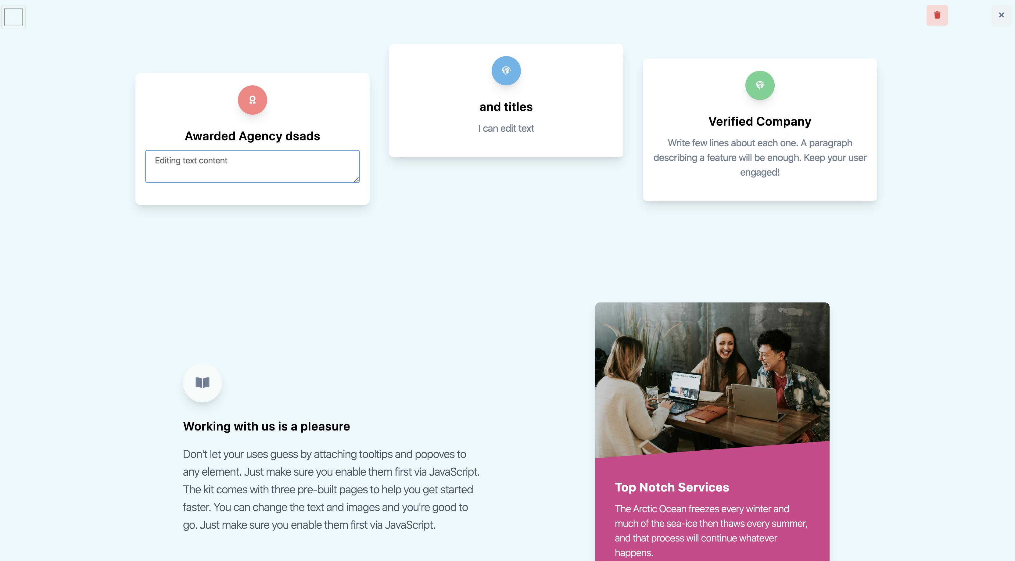
With each year, Javascript is becoming more and more popular and also more and more powerful. In the last year at BinarCode we had at least 2 projects with requirements to build dynamic interfaces that can be easily configured and adapted based on user needs. In this article, we will explore how to build such interfaces and the core principles behind configurable interfaces. We will do this with the help of 2 technologies: Vue.js and Tailwindcss so we can get to a working prototype as fast as we can.
Just before we go any further, here's an example of our end result so you don't waste time. If it intrigued you, follow along to know learn some interesting principles on how this can be achieved and scaled.
In another article we explored the ability to create draggable interfaces with Vue.js and Tailwind. We will build on top of those concepts here as well as extend it with more ideas. If you're new to draggable interfaces, I would recommend going through the article mentioned above first. We will start off with a set of components for a landing page. The UI components are build with TailwindCSS and are actually borrowed from a fresh Tailwind Starter Kit from Creative Tim. Our UI looks more or less like this:
The code for it is very simple for now including our components for each of the sections from the UI in the following way.
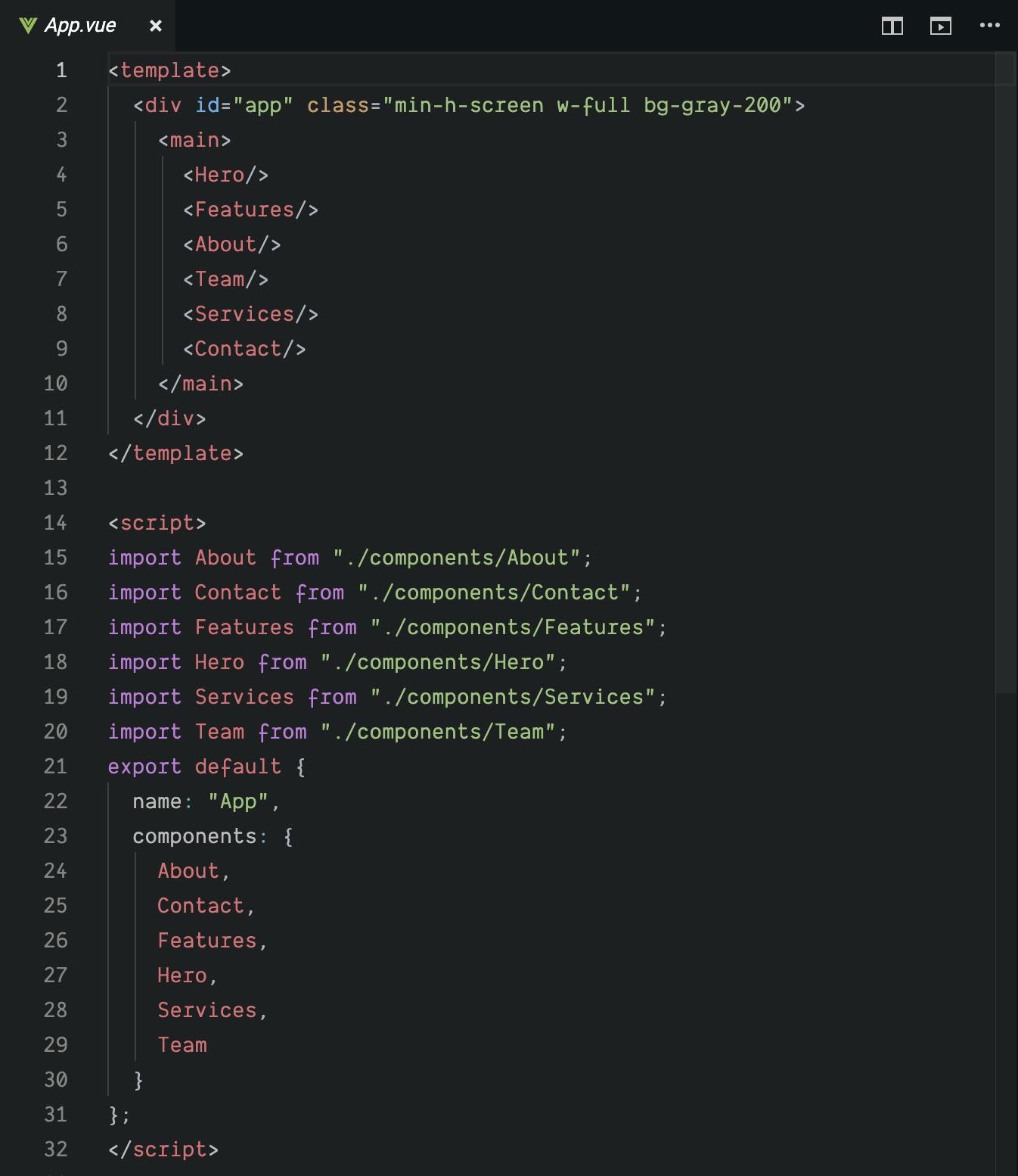
Looks pretty straightforward so far but it doesn't contain any dynamic parts in it. We could maybe add some props for each of the sections to configure the images/text, however changing the order of the components requires code changes.
If our end goal would be to allow users to change the order of the content, maybe change text and colors or even delete some sections, the current code doesn't help us much. It contains just some static content built as Vue components.
Let's take each of the features above and try to explore ways of achieving these feature.
Ordering content
This features requires thinking about a way on how we can architecture our code and components in such a way that we could potentially have control over the order of this components. In order to achieve this, we would have to get rid of any static or fixed declarations of components and represent the data of our interface in a different way. How can we do that ? Well, our interface from above can be quite easily represented as a JSON.
Let's define a simple JSON structure that will be a representation of our sections from above. In order to do that, we have to split our page logically into a couple of parts. To make this easier to grasp we'll use naming conventions similar to those from Vue.js.
Our page right now contains contains 6 components. Each component has a name, can accept some props and be rendered in a specific order. From here we can extract several useful keywords such as the page, the components, props and their order in the UI. Let's go ahead and build a JSON structure based on these keywords and the components from our code
const page = {
  components: [
    {
      name: "Hero",
      props: {}
    },
    {
      name: "Features",
      props: {}
    },
    {
      name: "About",
      props: {}
    },
    {
      name: "Team",
      props: {}
    },
    {
      name: "Services",
      props: {}
    },
    {
      name: "Contact",
      props: {}
    }
  ]
}
Now, that we have a JSON representation of our page, we could try and use it to render our components. Luckily, there's a neat feature that let's you render components dynamically by using the component tag. We can now just iterate through our JSON and render our components via dynamic component from Vue.js. Here's the code for that
<component
  v-for="(component, index) in page.components"
  :key="index"
  :is="component.name"
  v-bind="component.props"
/>
The end result is pretty much the one we had before but now we have the flexibility of changing our JSON so we can re-order our UI. This is already quite handy since we could potentially store this JSON in a database and change it for different users.
Alright, since we are done with this part, let's explore how we could allow users to change the order of the content themselves which in the end will change the underlying JSON structure we just built.
A pretty popular and UX friendly way to do this is by highlighting a certain component when it's clicked. Below is such an example.
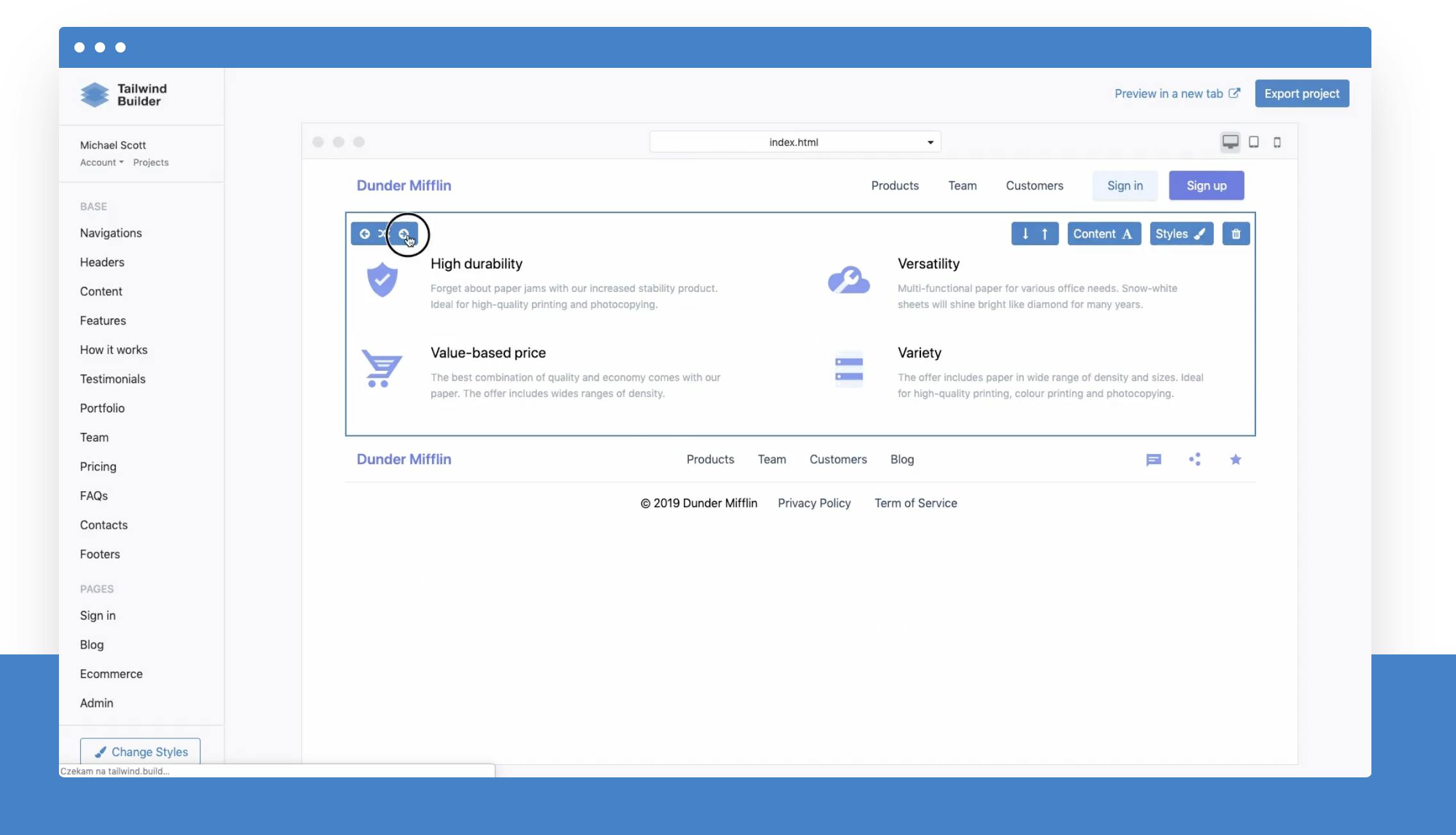
We will start off buy implementing a component that will help us with this highlighting and for now, contain 2 arrow buttons to re-arrange the sections. First, we will define a ComponentEditor.vue component which will handle this part. This component will contain a container, a slot and an aboslute position div which will appear over our components. Here's the code for it
<template>
  <div class="relative">
    <div
      v-show="active"
      class="z-10 h-full w-full absolute"
      :class="{'border-4 border-teal-400 ': active}"
    ></div>
    <slot></slot>
  </div>
</template>

<script>
export default {
  props: {
    active: Boolean
  }
};
</script>
The absolute positioned div will be displayed only when this component has an active prop set to true. Let's modify our code from App.vue file to handle this logic. First, we have to wrap each dynamic component with our new ComponentEditor and save some state to store the current active component.
<template>
<ComponentEditor
  v-for="(component, index) in page.components"
  :key="index"
  :active="component.name === activeComponentName"
>
  <component
    :is="component.name"
    v-bind="component.props"
    @click.native="toggleActiveComponent(component)"
  />
</ComponentEditor>
</template>
<script>
export default {
 data() {
  return {
   activeComponentName: '',
   // the page JSON representation
  }
 },
 methods: {
    toggleActiveComponent(component) {
      this.activeComponentName = component.name;
    }
 }
}
</script>
Now whenever we click any of the sections, we should see a border around the clicked section
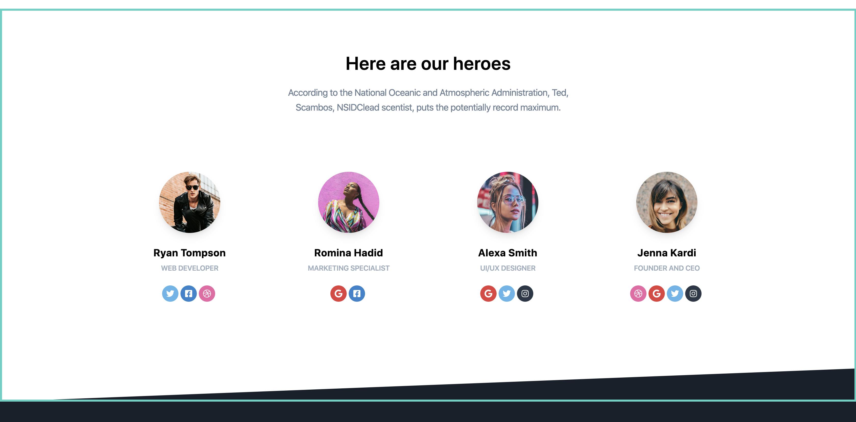
Great, let's add the arrow buttons and the delete button into our ComponentEditor.vue file
<div class="flex justify-end w-full mt-3">
        <button
          v-if="index < total - 1"
          @click="emitAction('move-down')"
          class="text-xs font-semibold inline-block py-2 px-3 uppercase rounded text-teal-600 bg-teal-200 mr-2 focus:bg-teal-600 focus:text-white"
        >
          <i class="fas fa-arrow-down" aria-hidden="true"></i>
        </button>
        <button
          v-if="index > 0"
          @click="emitAction('move-up')"
          class="text-xs font-semibold inline-block py-2 px-3 uppercase rounded text-teal-600 bg-teal-200 mr-2 focus:bg-teal-600 focus:text-white"
        >
          <i class="fas fa-arrow-up" aria-hidden="true"></i>
        </button>
        <button
          @click="emitAction('close')"
          class="text-xs font-semibold inline-block py-2 px-3 uppercase rounded text-gray-600 bg-gray-200 ml-16 mr-2 focus:bg-gray-600 focus:text-white"
        >
          <i class="fas fa-times" aria-hidden="true"></i>
        </button>
      </div>
Our code editor highlighter will look now like this

Notice that each button has a common method emitAction being called. The method will make sure to emit the specific event as well as send some extra metadata such as the component information for example.
Here's the javascript part for our ComponentEditor.vue component
export default {
  props: {
    active: Boolean,
    component: Object,
    index: Number,
    total: Number
  },
  methods: {
    emitAction(actionName) {
      this.$emit("action", {
        name: actionName,
        component: this.component
      });
    }
  }
};
We added a few extra props so we can hide the up arrow when first component is selected and down arrow when last one is selected. We also now emit each event with the same name and pass an object with even details instead. Our App.vue code will change in order to handle these actions
Now, we just need to define the handleEditorAction method. It will be responsible for handling move down, move up and close actions. Let's see how that looks.
<ComponentEditor
  v-for="(component, index) in page.components"
  :key="component.name + index"
  :active="component.name === activeComponentName"
  :component="component"
  :index="index"
  :total="page.components.length"
  @action="handleEditorAction"
>
  <component
    :is="component.name"
    v-bind="component.props"
    @click.native="toggleActiveComponent(component)"
  />
</ComponentEditor>export default {
methods: {
toggleActiveComponent(component) {
this.activeComponentName = component.name;
},
handleEditorAction(action) {
const { name, component } = action;
const oldIndex = this.page.components.findIndex(
c => c.name === component.name
);
let newIndex = oldIndex;
if (name === "close") {
this.activeComponentName = "";
} else if (name === "move-down") {
newIndex = oldIndex + 1;
} else if (name === "move-up") {
newIndex = oldIndex - 1;
}
this.reOrderComponent(oldIndex, newIndex);
},
reOrderComponent(oldIndex, newIndex) {
if (oldIndex === newIndex) {
return;
}
const tempComponent = this.page.components[newIndex];
const componentToMove = this.page.components[oldIndex];
this.page.components.splice(newIndex, 1, componentToMove);
this.page.components.splice(oldIndex, 1, tempComponent);
}
}
}We have our method defined plus one more helper method to swap indexes of 2 objects from our json. Notice that we use Javascript Splice in order to maintain reactivity on the page.components array since this is a change detection caveat from Vue 2. Along with the Vue.js 3 that is coming really soon, this will no longer be an issue and for Vue 3, such code can be simplified by directly accessing and modifying arrays. Here's what we achieved so far
Yaayy! We have a page in which we can re-order the content. We can also add another action to delete the current component very easily by adding a new delete button in the ComponentEditor
<button
  @click="emitAction('delete')"
  class="text-xs font-semibold inline-block py-2 px-3 uppercase rounded text-red-600 bg-red-200 mr-2 focus:bg-red-600 focus:text-white"
>
  <i class="fas fa-trash" aria-hidden="true"></i>
</button>handleEditorAction(action) {
// other actions
else if (name === "delete") {
this.page.components.splice(oldIndex, 1);
}
}Changing background colors
<component :is="component.name"
           v-bind="component.props"
           @click.native="toggleActiveComponent(component)"
/>
In order to allow editing the background color or some other general properties in a scalable way, we'll have to abstract this into a component of its own. We'll call it ComponentRendenrer. The component will looks more or less like this:
<template>
  <component :is="component.name"
              v-bind="component.props"
              :style="componentStyles"/>
</template>
<script>
import Features from "../components/Features";
export default {
  components: {
    Features,
  },
  props: {
    component: Object
  },
  computed: {
    componentStyles() {
      let validStyles = ["backgroundColor"];
      let styles = {};
      validStyles.forEach(property => {
        if (this.component.props[property]) {
          styles[property] = this.component.props[property];
        }
      });
      return styles;
    }
  }
};
</script>
Although it's a bit abstract, it's just a wrapper that passes on the props and some extra css styles. In this case we allow passing backgroundColor as a css style property if we find it in our component props. So for example if our JSON component definition looks like this:
{
  name: "Features",
  props: {
    backgroundColor: "#fff",
  }
}
Then the backgroundColor prop will be passed to the component to be rendered like this:
:style="{backgroundColor: "#fff"}"Now you might understand why we needed this component renderer. This way we can now add background color or other style properties on any of our section components quite easily through our JSON that represents our components.
The only remaining part is to add some visual "tools" to change the background color. For this, we created a ColorPicker.vue component which you can find here. We won't go into too much details on how it's implemented but will look into how we can use it. In our ComponentEditor.vue we can add it similar to how we added the arrow buttons. The only difference in this case will be that we'll modify the component props directly.
<ColorPicker v-model="selectedColor" @active-change="onColorChange"/>data() {
return {
selectedColor: this.component.props.backgroundColor
};
},
methods: {
onColorChange(color) {
this.emitAction("color-change", {
value: color
});
}
}After this, we just have to handle this new action inside our main App.vue file
else if (name === "color-change") {
   this.$set(component.props, "backgroundColor", data.value);
}
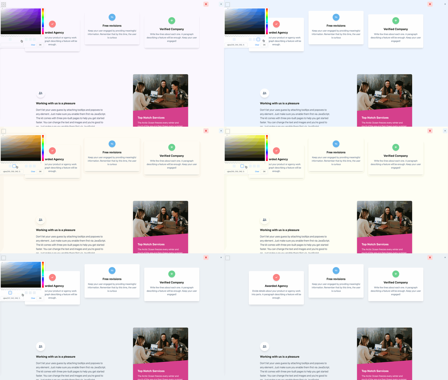
In the end it just sets the backgroundColor property inside the component props object. Visually this looks like in the gif below. Pretty cool right ?
Editing text content
- A way to retrieve a certain property from a component.
- A way to save certain properties to a component.
- Components to allow us to modify the text and the icons.
- Use the components from point 3 inside our section rather than normal html tags.
First 2 points are rather easy. We can just create some functions for that. We will define a new file to handle that
import set from "lodash/set";
import get from "lodash/get";
let localStoragePage = getFromStorage();

export let page = localStoragePage || {
  components: [
    {
      name: "Features",
      props: {
        id: 4,
        feature1: {
          title: "Awarded Agency",
          icon: "fas fa-award",
          description:
            "Divide details about your product or agency work into parts. A paragraph describing a feature will be enough."
        },
        feature2: {
          title: "Free revisions",
          icon: "fas fa-retweet",
          description:
            "Keep your user engaged by providing meaningful information. Remember that by this time, the user is curious"
        },
        feature3: {
          title: "Verified Company",
          icon: "fas fa-fingerprint",
          description:
            "Write few lines about each one. A paragraph describing a feature will be enough. Keep your user engaged!"
        },
        work: {
          icon: "fas fa-book-open",
          title: "Working with us is a pleasure",
          description: `Don't let your uses guess by attaching tooltips and popoves to any element. Just make sure you enable them first via JavaScript. The kit comes with three pre-built pages to help you get started faster. You can change the text and images and you're good to go. Just make sure you enable them first via JavaScript.`,
          checkText: "Check tailwind starter kit",
          imageTitle: "Top Notch Services",
          imageDescription:
            "The Arctic Ocean freezes every winter and much of the sea-ice then thaws every summer, and that process will continue whatever happens."
        }
      }
    }
  ]
};

saveToLocalStorage();
export function setComponentProperty(componentId, path, value) {
  const componentIndex = page.components.findIndex(
    c => c.props.id === componentId
  );
  const fullPath = `components[${componentIndex}].props.${path}`;
  set(page, fullPath, value);
  saveToLocalStorage();
  return page;
}

export function saveToLocalStorage() {
  localStorage.setItem("page-state", JSON.stringify(page));
}

export function getFromStorage() {
  return JSON.parse(localStorage.getItem("page-state"));
}

export function getComponentProperty(component, path) {
  return get(component, path, "");
}
In this file we represent both our page state and have some utility functions to access and set properties to it. One extra thing here is that we save to local storage after each change. In a real scenario, you'd most likely want to throttle these changes so it doesn't impact performance or create a top level "Save changes" button somewhere and save the changes in a database.
<template>
  <el-tooltip content="Click to edit" placement="top" :open-delay="400" :hide-after="1500">
    <component
      :is="htmlTag"
      :autosize="{ minRows: 2, maxRows: 20}"
      ref="inputRef"
      v-bind="$attrs"
      v-on="$listeners"
      @click="onClick"
      @blur="onBlur"
      type="textarea"
      class="cursor-pointer"
    >{{$attrs.value}}</component>
  </el-tooltip>
</template>
<script>
export default {
  inheritAttrs: false,
  name: "TextEdit",
  props: {
    tag: {
      type: String,
      default: "div"
    }
  },
  data() {
    return {
      componentType: this.tag
    };
  },
  computed: {
    htmlTag() {
      if (this.componentType === "el-input") {
        return "el-input";
      }
      return this.tag;
    },
    isEditMode() {
      return this.componentType === "el-input";
    }
  },
  methods: {
    onClick() {
      if (this.componentType !== "el-input") {
        this.componentType = "el-input";
        this.$nextTick(this.focusInput);
      }
    },
    focusInput() {
      if (this.$refs.inputRef && this.$refs.inputRef.focus) {
        this.$refs.inputRef.focus();
      }
    },
    onBlur() {
      if (this.componentType === "el-input") {
        this.componentType = this.tag;
      }
    }
  }
};
</script>
It might be quite confusing at first, but the idea is that it renders html based on the provided tag prop and an el-input component when clicked. Note that for now it doesn't handle any restrictions or validations such as not being able to edit, but those are not in the scope of this article. Let's move on and see how we can use this component.
In our Features.vue we can replace the html text tags like this:
<h6 class="text-xl font-semibold">Awarded Agency</h6>To this:
<TextEdit
  tag="h6"
  class="text-xl font-semibold"
  :value="getComponentProperty('feature1.title')"
  @input="value => setComponentProperty('feature1.title', value)"
/>
It's a bit more verbose but it allows us to edit the text in a generic way. We can provide the html tag, css classes and a way to pass in the value and set it based on the @input event. As an additional example, a paragraph would look like this.
<TextEdit
  tag="p"
  class="mt-2 mb-4 text-gray-600"
  :value="getComponentProperty('feature1.description')"
  @input="value => setComponentProperty('feature1.description', value)"
/>
Almost the same with a few minor prop changes. This can be extended later on to be able to maybe choose the font color, size or spacing perhaps. The possibilities are endless. There's one more editable component which let's you change an icon. You can find it in the codesandbox but the usage of it looks like this:
<IconSelect
  :value="getComponentProperty('feature1.icon')"
  @input="value => setComponentProperty('feature1.icon', value)">
  <div
    class="text-white p-3 text-center inline-flex items-center justify-center w-12 h-12 mb-5 shadow-lg rounded-full bg-red-400">
    <i :class="getComponentProperty('feature1.icon')"></i>
  </div>
</IconSelect>
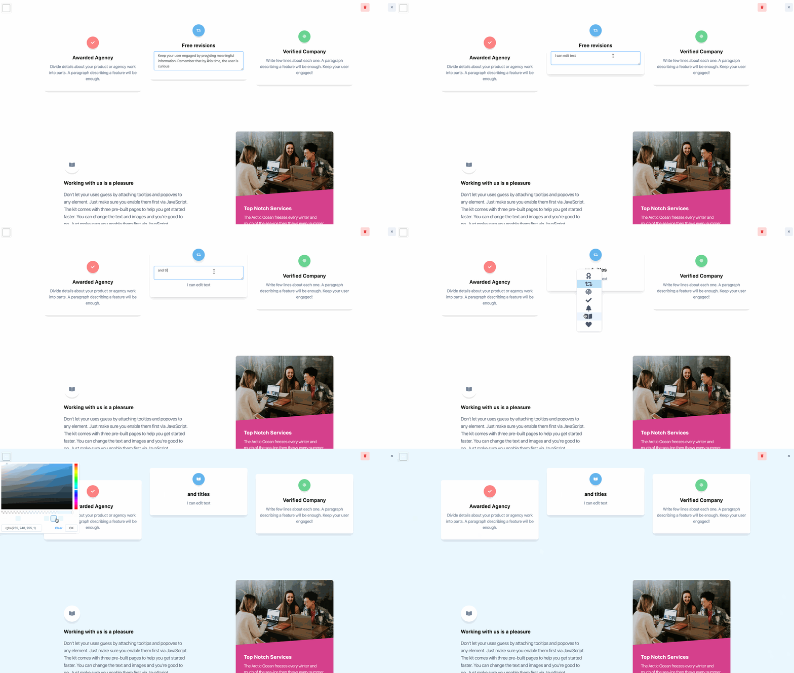
It uses a slot to render the content and the same ideas to get and set the icon value. Here's how it looks. Feel free to play with it
Conclusion
Congrats if you've made it this far. It's been a pretty long read for sure. To recap, we explored ways to make our interfaces customizable with the help of Vue,js and Tailwindcss. At the core we used dynamic components to abstract our rendering and then represented our interface as JSON. This is more of a proof of concept and far from a real working application but the basic ideas would apply:
- Abstract the html rendering into a single component
- Represent the interface as a JSON
- Render the interface based on the JSON state
- Modify the interface by modifying small parts of the JSON
- Have fun and explore new ideas
Hope you liked and enjoyed this article. If you did, please share it, leave a comment or join or newsletter below for future content like this. If you want to implement a project like this, struggling to do so or just want to share your experience, feel free to contact us as we already did 2 complex projects that handled customization of layouts, images, fonts, content order, SEO, new custom pages & more.

